Hello there, friends!
Surprise, it's me again. Soooooooooo I've revised the storyboards from last time for my video. I think a have a better grasp on what I'll be doing now. I'm doing three 30 second videos (hopefully shorter than 30 sec) to show the three different gamesfunctions) that this app is capable of doing. I don't think I could do it successfully in one 30 second video, so separating all these games into different videos will help a lot.
Here's the storyboards:
So basically, each video will start off with some vector characters that I create to set up the scene, then the video will go into the screens, next it will show the composition will split in half showing the device on one side & the sphero interacting with the device on the other side, and finally all the videos will end with the logo and some sort of tag line.
Additionally to figuring out how the video will work sequentially, I found music that I want to use and I also have all the footage I need for the sphero. I can't remember if I mentioned this in one of my previous posts or not, but I made due with a plain white ball for a sphero (I'm poor lol). I attached fishing line to the ball and taped it moving. I'm not sure if that makes sense, but trust me, it will! It basically just looks like the ball is moving on its own, and I'm not helping it at all! Except for the parts that humans are actually grasping the ball and using it to spell words.
After really thinking about user testing, I revised my screens. My user said I needed a back button, but after having reading Krug and talking extensively about the importance of navigation bars in class, I decided to make a very simple navigation bar for all of the screens. Here's a sample of what it looks like:
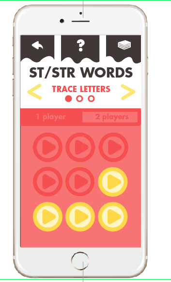
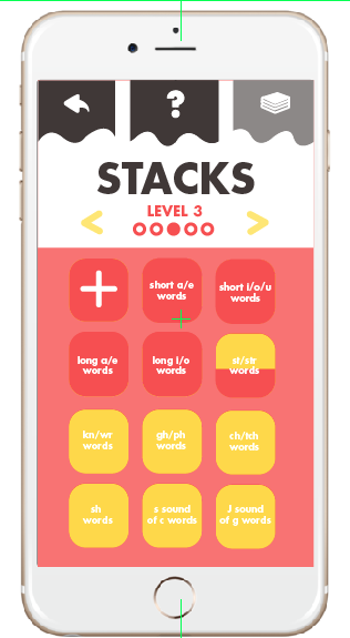
So on the far left is what my user asked for during user testing: a back button. On the right, I added a Stacks button (which is basically a home button), so users can always get back to the stacks with just one click of a button at the top. I also added that question mark in the middle to click on whenever directions are needed. I think this will be especially useful during the games. If users are confused, they can just touch the question mark for directions, but this way, the directions aren't always in the user's faces. I had it before that directions were there EVERY time, so now, they're only there if the user asks for them. The second picture shows how the button is light grey whenever users are on that specific page: the stacks page or a directions page. The back button isn't a page, but it will change to that light grey color when clicked.


