For this online museum, I have chosen to display my collection of lipstick (my favorite thing ever). To better understand what I have in mind for this museum, here is my planning sheet:
So after revising and editing this planning sheet over and over, I think I've finally landed on the specifics (shown above). Next, was the site maps. The site maps, shown below, show the general pattern or way of moving through the website. Each square is something the user can click on. I have three different ways of maneuvering the website:
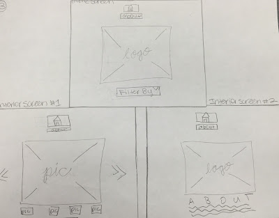
Now for a more specific idea of what the website might look like, I made wireframes. These wireframes give a clearer idea of the composition of the website as well as the scale/proportion.
BAM. There it is. I'm leaning more towards that last idea (it's labeled number 2, but its the last picture). Once I figure everything out, I'll post what direction I end up heading in.


No comments:
Post a Comment