Showing posts with label poster. Show all posts

Saturday, April 4, 2015

Beyond the Social Poster: Final Deliverables

Project Statement:
When it comes to this particular issue, not many people know about it, especially here in America. I have deepened my audience's understanding by giving them information about what the poster is actually entailing. The poster is hard to understand without any background, so my prototypes give the audience appropriate information to understand what the issue is. 

When it comes to logos and pathos, I used a heavy amount of logos within the magazine prototype. There are plenty of spreads within the magazine that share information about the Green Movement. I used pathos in both the magazine as well as the Instagram account. The magazine contains intriguing and raw  pictures of the revolution. Most of these pictures are pretty intense, and I did that to tug at the audience's emotions. I also used pathos in the Instagram account. I used pathos throughout the Instagram account by guilting my audience because that will definitely pull at their emotions.

I generated empathy by including those intense pictures within the magazine. That way individuals will flip through it, see the pictures, and think "Wow these poor people voted and they ended up being ruled by someone they dislike. I would be so upset if that happened to me. I want to join in with these people who are so passionate about voting."

When it comes to the context of the work, I didn't want anything to compete with the poster. To accomplish this, I made sure the magazine was big enough to be seen, but not big enough to be overwhelming. With the poster being 20 x 30 and the magazine being 4.5 x 7, I think I achieved that. The Instagram account is not shown within the museum because it is referenced several times throughout the magazine, and people can access it from their own phones/tablets within the museum.  With the Instagram not being displayed and the magazine being small, it is obvious that they are extensions of the poster. When it comes to the audience, I made sure to choose things that are audience will be glad to take interest in. So the magazine is something the audience will want to look at to understand the poster, and I know that the vast majority of the audience will have a phone on them to access the Instagram.

To make everything work together in a unified fashion, I have taken the themes (specifically the theme of green) within the original poster and am using that theme to connect my prototypes and the poster together. I connected my two prototypes together by, once again, using the same shade of green as well as using the same fonts and the repeated peace sign icon. 


Mockup of Musuem:


Tuesday, March 31, 2015

Process Post: Beyond Social Poster

Hello there!


I've refined lots since I did user testing. Here's what I've done:

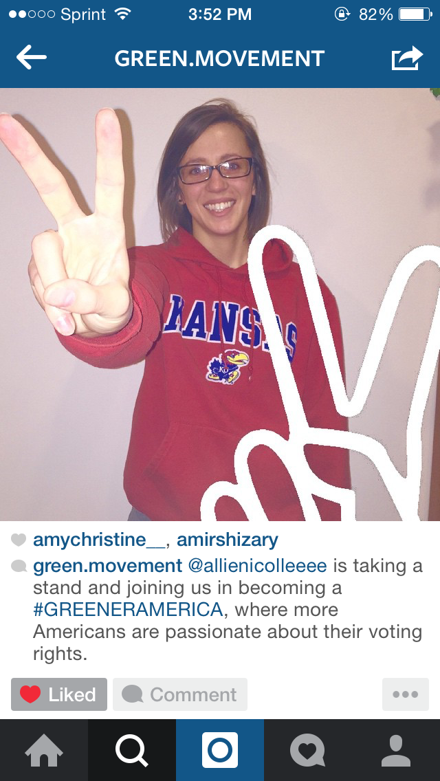
I decided to combine the magazine and the instagram, those were the two my users responded to best.  In order to combine them, though, I had to revise them to complement each other. I made the design of the magazine fit more towards the instagram account. The magazine prototype focuses on the "People of Iran" and the facts, stories, pictures, etc of the Green Movement that occurred in Iran. It's based off of logos (due to all the facts) and also based on pathos (through all the striking images). On the other hand, the instagram is more of a call to action. It represents the people of America who have been to the museum and want to take action. The instagram features people who are taking a stand to become more like Iran when it comes to voting rights. The magazine references the instagram so that after users are done reading about the crazy event in Iran, they can then turn to the instagram to take action.

Magazine:


There are many more pages, but I wanted to shorten it a little bit to save time.

Instagram account:


There are many more posts on the Instagram account as well.


Sunday, March 29, 2015

User Testing Exploration

 So over the past week, I did some user testing on two different people. I got some great feedback, and I'm definitely happy that I was able to do it.

If you look back on my previous post, I posted the pairs of prototypes that I tested on the following users.

User Testing #1: Sandra Betram


Here is what Sandra said about each prototype:


User Testing #2: Allie Carleton


After talking to both of them and getting good feedback, I felt a lot better about the direction I wanted to go in. They both like the idea of somehow combining the magazine and the Instagram account together! So when I begin revising, I want to revise the magazine to go along with the account a little more (design wise), and I will put as much information in there as possible. That way, users will get plenty of information from the magazine, and the instagram account gives them an outlet to take action.

Monday, March 23, 2015

Spring Break Progress

Hello!

Over spring break I refined my first round of prototypes, and I also developed my second round of prototypes. Here are the three refined pairs of prototypes I'll be using for user testing:


1: Magazine and Shirt pins/buttons

I made the magazine much smaller (so it doesn't compete with the original poster), and I added more content to it. I added another section to the magazine. The first section of the magazine is dedicated to the "people of Iran" and explaining the Green Movement's events and how Iranians were affected. The second half of the magazine is dedicated to "people of America." This section is dedicated to People of America (a few people I selected to have featured in the magazine) who share why Americans should be passionate about voting and why they vote.

For the the second prototype to go with the magazine, I decided a series of buttons would be a good idea. Buttons saying "People of America, we vote"  "Join Us"  "I Vote"


2: Rebellions Signs and Taking a Pledge:

For the rebellion signs (signs mimicking what the protestors held up during the Green Movement), I made them much smaller and I created more of them. To go along with the signs, I developed a sheet of paper for people to sign to take a pledge and vote in upcoming elections.


3: Instagram Account and Merchandise:

When it comes to Instagram account, I revised this as well. I created an actual account, and uploaded photos onto it. This account is branded with a couple of hashtags and, of course, the peace sign (which was the icon of the movement in Iran). Each picture has a green overlay with either a peace sign or one of the two hashtags over it. I also have pictures of people holding up the peace signs themselves, which is basically saying that they will take a stand and vote.

To go along with this branded account, I thought merchandise would be a good second prototype (to get the account's name out there so more people will view it). Here are mocked up versions of a V Neck, shirt buttons, and water bottles for people to pick up while they're at the exhibit. Who would walk by and pass up a free tshirt, water bottle, or button? I think that's the best way to get the account's name out there and draw attention to the fact that more Americans need to vote


So there's all the revisions and progress I've made. I'll being doing user testing this week and posting about it as well.