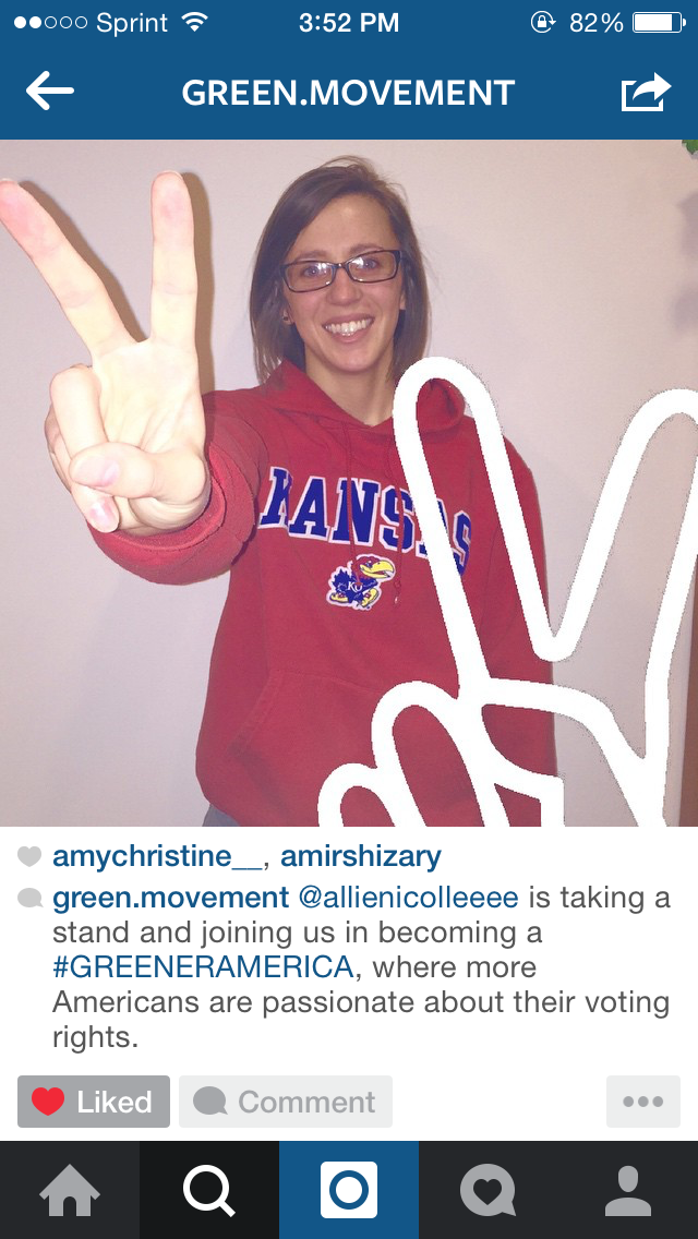
I've refined lots since I did user testing. Here's what I've done:
I decided to combine the magazine and the instagram, those were the two my users responded to best. In order to combine them, though, I had to revise them to complement each other. I made the design of the magazine fit more towards the instagram account. The magazine prototype focuses on the "People of Iran" and the facts, stories, pictures, etc of the Green Movement that occurred in Iran. It's based off of logos (due to all the facts) and also based on pathos (through all the striking images). On the other hand, the instagram is more of a call to action. It represents the people of America who have been to the museum and want to take action. The instagram features people who are taking a stand to become more like Iran when it comes to voting rights. The magazine references the instagram so that after users are done reading about the crazy event in Iran, they can then turn to the instagram to take action.
Magazine:
There are many more pages, but I wanted to shorten it a little bit to save time.
Instagram account:


There are many more posts on the Instagram account as well.


No comments:
Post a Comment