Sup fellas?!
Over the weekend, I had lots to design. SO GET EXCITED BECAUSE THERE'S SO MANY THINGS TO SHARE WITH YOU!
Refined Essay Spread:
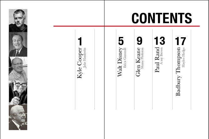
Three Table of Contents Spreads:
Three Title Pages:
Welp, there they are! I'll keep y'all updated on refinements and fun things like that
-----------------------------------------------------------------------------------


They look good. The title on the title pages would make more sense on the right, as that is where we first look. The text shouldn't extend over the spine, particularly on the title page. You could move your publishers mark to the left and make it smaller. Now for fun things like refinements.
ReplyDeleteLove your designs Amy :)
ReplyDelete