Tuesday, March 31, 2015

Journal Entry: Found stuff #2

Lately, I've been feeling inspiring by big letterforms that are cropped in some way such as the following:

First of all, I was immediately drawn into this image because of the huge
text. I then started to notice the cropping. I love how my eye completes what
the designer has cropped off. It's still eligible, just more interesting this way. 


If the business card didn't crop off the
text a little bit, I don't think I would've
been as drawn to it as I was. It forces
me to make sense of what's there and
what is not.


Cropping doesn' t necessarily mean cut off
letters to the end of the page. This example
shows a different way to crop, which I also
enjoy. It feels as though the lines are
revealing a secret, and the A is just peeping
out beyond them. It wouldn't be nearly as
intriguing if there was just a big A, not
cropped at all, in the middle of the page. 


Process Post: Beyond Social Poster

Hello there!


I've refined lots since I did user testing. Here's what I've done:

I decided to combine the magazine and the instagram, those were the two my users responded to best.  In order to combine them, though, I had to revise them to complement each other. I made the design of the magazine fit more towards the instagram account. The magazine prototype focuses on the "People of Iran" and the facts, stories, pictures, etc of the Green Movement that occurred in Iran. It's based off of logos (due to all the facts) and also based on pathos (through all the striking images). On the other hand, the instagram is more of a call to action. It represents the people of America who have been to the museum and want to take action. The instagram features people who are taking a stand to become more like Iran when it comes to voting rights. The magazine references the instagram so that after users are done reading about the crazy event in Iran, they can then turn to the instagram to take action.

Magazine:


There are many more pages, but I wanted to shorten it a little bit to save time.

Instagram account:


There are many more posts on the Instagram account as well.


Sunday, March 29, 2015

Journal Entry: Thinking Form

Roman Cieslewicz:


Roman Cieslewicz is a famous designer from Poland. He is known for working for Vogue, Elle, created a graphic concept for Paris autumn festival, and taught at  Ecole national superieure des arts graphisques. He is also well known for several posters; in fact, he's designed over 380 posters over the course of his career. What I like about the two images above is the contrast in color. They both really pop out at me due to the contrast between the black and the red/orange/pink gradient in the background.

Bruno Monguzzi:


Bruno Monguzzi is a famous designer from Switzerland. He attended school at Ecole des arts decoratifs in Geneva and he received a scholarship to study typography, photography and gestalt psychology in London. Mongguzi was the designer for Museo Cantonale d’Arte, Lugano. What I find appealing about the two images I chose above is the bold black text against the colors in the background. The text and the colors work together harmoniously and captured my attention.

Aldo Calabresi:


 Born in 1930, Calabersi Swiss designer was known for his work in advertising. He later on began working at the Studio Bogari in Milan. His work was also shown   in the “Ten Milan Designers” exhibit in NYC. I picked the two images above because I think that the layering he used here was really interesting. It produces a nice contrast, and just an appealing image to look at overall. I personally love his style, in particular, his work that demonstrates the use of black and white photos with vibrant colors layered on top. It creates a beautiful contrast and and interesting distortion of the original imagery.

Ben Boss:


Boss is a designer from the Netherlands. He began as a copywriter at Ahrend and then went onto work for Total Design as well as 2d3d. What I like about his work is how simplistic it is. There's something to be said for the simplicity of his work. It's beautiful and eye catching. 


Wim Crouwel:


Born in the Netherlands, Crouwel attend the Academy of Arts and Crafts Grningen as well as the Institute for Arts and Crafts Amsterdam. He started out as a freelance graphic designer, and then went on to work other places. He went into partnership with Kho Liang Je. A year later he collaborated with him in the Atom Exhibition, Amsterdam. He ended his career becoming a full time professor at Deift University. What stood out to me about his work is the above two images. I love how well he combined architecture and type. It looks like they go together, but they're two completely different thing. He did a nice job of using type and architecture to work harmoniously together.

Bradbury Thompson:


Thompson is a famous designer from Connecticut. He graduated from Washburn University, and them began working at Capper Publication and he promoted to be an Art Director with Rogers-Lellog-Stillson. At the end of the WW I, Thompson experimented with CMYK color process to create some motions. He also interpreted the spirit of artist through his typography. What I love about the two images above is his experimentation with color and overlay. The color immediately drew me in, but when looking at the images closer, the overlay made everything even more interesting than before. 


User Testing Exploration

 So over the past week, I did some user testing on two different people. I got some great feedback, and I'm definitely happy that I was able to do it.

If you look back on my previous post, I posted the pairs of prototypes that I tested on the following users.

User Testing #1: Sandra Betram


Here is what Sandra said about each prototype:


User Testing #2: Allie Carleton


After talking to both of them and getting good feedback, I felt a lot better about the direction I wanted to go in. They both like the idea of somehow combining the magazine and the Instagram account together! So when I begin revising, I want to revise the magazine to go along with the account a little more (design wise), and I will put as much information in there as possible. That way, users will get plenty of information from the magazine, and the instagram account gives them an outlet to take action.

Tuesday, March 24, 2015

Journal Entry: Found Stuff

Greetings!


Lately, I've been really inspired by hand lettering. There's something so simple yet striking and bold about using hand lettering. I have to admit though, I love seeing hand lettering and water color combined. I would LOVE to, someday, be able to create lettering as beautiful as these that I've found:

This lettering is very fun and lively, but what I love
about this is that the lettering would look completely
different if it wasn't made in water door. Imagine if it
was just black ink, it would have a completely
different connotation! Water color gives the letters a
beautiful, natural look.


What I love about this is how well you can see the contrast
of value within the lettering. With water color, letters have so
much more value, and I think that makes them far more
appealing and aesthetic. 


The way the water color is used here really makes the letters pop. I think this is a perfection example to show that water color forces you to not be perfect and precise. It's a very free and loose technique to make lettering. That's another reason it is so interesting to look at.


Another great of example showing the different
values within the letterforms. It almost looks as if
there was a gradient applied to the letters. 


Monday, March 23, 2015

Spring Break Progress

Hello!

Over spring break I refined my first round of prototypes, and I also developed my second round of prototypes. Here are the three refined pairs of prototypes I'll be using for user testing:


1: Magazine and Shirt pins/buttons

I made the magazine much smaller (so it doesn't compete with the original poster), and I added more content to it. I added another section to the magazine. The first section of the magazine is dedicated to the "people of Iran" and explaining the Green Movement's events and how Iranians were affected. The second half of the magazine is dedicated to "people of America." This section is dedicated to People of America (a few people I selected to have featured in the magazine) who share why Americans should be passionate about voting and why they vote.

For the the second prototype to go with the magazine, I decided a series of buttons would be a good idea. Buttons saying "People of America, we vote"  "Join Us"  "I Vote"


2: Rebellions Signs and Taking a Pledge:

For the rebellion signs (signs mimicking what the protestors held up during the Green Movement), I made them much smaller and I created more of them. To go along with the signs, I developed a sheet of paper for people to sign to take a pledge and vote in upcoming elections.


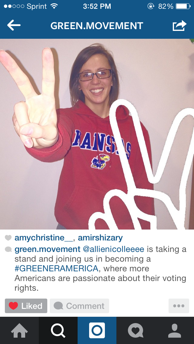
3: Instagram Account and Merchandise:

When it comes to Instagram account, I revised this as well. I created an actual account, and uploaded photos onto it. This account is branded with a couple of hashtags and, of course, the peace sign (which was the icon of the movement in Iran). Each picture has a green overlay with either a peace sign or one of the two hashtags over it. I also have pictures of people holding up the peace signs themselves, which is basically saying that they will take a stand and vote.

To go along with this branded account, I thought merchandise would be a good second prototype (to get the account's name out there so more people will view it). Here are mocked up versions of a V Neck, shirt buttons, and water bottles for people to pick up while they're at the exhibit. Who would walk by and pass up a free tshirt, water bottle, or button? I think that's the best way to get the account's name out there and draw attention to the fact that more Americans need to vote


So there's all the revisions and progress I've made. I'll being doing user testing this week and posting about it as well.